Urban networks
Decoding the urban sprawl: world’s most complex metro maps
In the sprawling metropolises of Tokyo, London and Paris, urban metro networks are vital for keeping things moving, but laying out these complex systems intuitively for passengers is no easy feat. Joe Baker explores the maps for the most complicated underground networks in the world to find out how they have evolved over the years
As
the world’s biggest cities become increasingly populous, demand for capacity on underground metro networks has also skyrocketed. As metros mutate and change shape, the transit maps that serve them become increasingly complicated maelstroms of information, leaving many a tourist shuddering in despair on the platform.
Perhaps this is a slight exaggeration. But scientists have repeatedly looked at the ability of transit maps to convey information effectively to commuters. In 2016,
researchers Riccardo Galloti, Mason A. Porter and Marc Barthelemey looked into the difficulty of navigating transportation in so-called ‘megacities’ (i.e. urban areas with human populations surpassing ten million). This involved calculating the maximum transit map information an average person could understand at any one time – a ‘cognitive overload’ limit – by analysing the world’s 15 largest metropolitan networks.
The researchers found that the New York City subway map was the most complex of the list, with a total of 161 total possible connections – making it the closest to their predetermined cognitive limit of 250. In pursuit were metros in Paris with 78 connections, Tokyo with 56, and London with 48.
The evolution of metro maps, from attempts at geographical accuracy to more schematic designs, has been necessary for comprehension, but consistent attempts to redesign maps to make them easier to understand demonstrate there could still be room for improvement. Exploring the history of six of the most complex metro maps available highlights how they have evolved to this head-scratching point.
New York City Subway
Clocking in at 472 stations in operation across various boroughs, the New York City Subway is easily the largest rapid transit system in the world.
Because the subway was originally built by three separate companies, no official map existed until 1940 when the companies were consolidated under the New York Board of Transportation. However, it has since seen numerous revisions, one of the most influential of which was unveiled by graphic designer Massimo Vignelli in August 1972.
Vignelli’s map took a more modernist schematic approach, rather than striving for geographical accuracy. Overground features were foregone in favour of a colour-coded system with 45 degree angles and even distances between stations. Nevertheless, geographic inaccuracies – such as Central Park being represented as square rather than rectangular – put a number of New Yorkers’ noses out of joint, and a new map was introduced in 1979 by the MTA Subway Map Committee.
The latest map style, first introduced in 2010 and tweaked in the years since, remains one of the only major metro maps to show off its city’s parks and streets alongside curved subway lines.
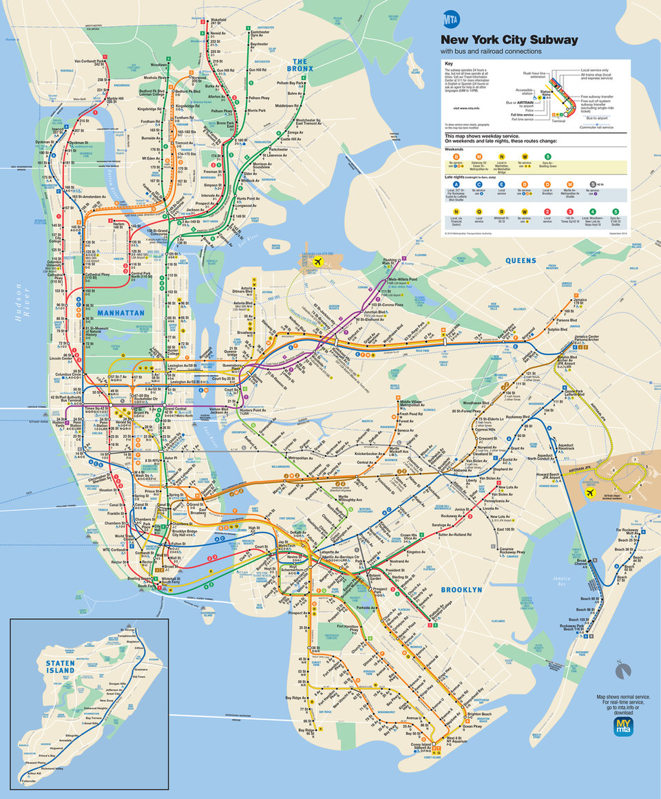
Image courtesy of MTA
Tokyo Metro/Toei Subway
One of the most extensive and busy networks in the world, Tokyo’s metro system is also one of the most complex due to the number of different operators involved. Its map showcases Tokyo Metro’s 179 stations across nine lines and 195km of track, in addition to the Toei Subway’s 99 stations across four lines and 109km of track. This is before the inclusion of lines owned by Japanese Railways (JR) and private companies. Each line has its own colour, letter and station number.
Several designers have taken on the challenge of trying to redesign Tokyo’s subway map to make it easier to understand. The Land, Infrastructure, Transport and Tourism Ministry is now planning to standardise station maps at train and subway stations in Tokyo in preparation for the 2020 Olympic and Paralympic Games.
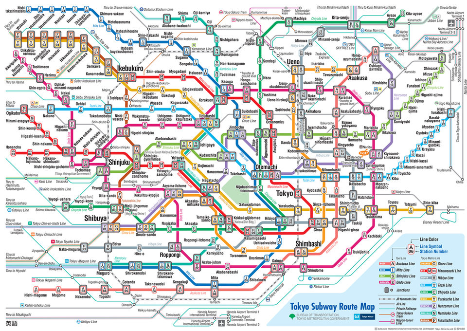
Image courtesy of Tokyo Metro
London Underground
The London Underground’s metro map is often cited as the biggest influence on other schematic map designs that have since been introduced on other metros worldwide.
Its design harks back to Harry Beck, a former draughtsman with the Underground Electric Railways Company of London – the tube’s operator until 1933. His design was based on the belief that underground passengers were more concerned with finding the right station than geographically locating it, and thus the map was designed to replace the wavy curves of prior efforts with straight horizontal and vertical lines and 45° angles.
London’s network has grown substantially larger in the years since. The Jubilee line opened in 1979 and was vastly extended in 1999 – bringing the map to its current total of 270 tube stations. Further evolutions of the DLR and the upcoming Elizabeth line have led to additional map tweaks. Nevertheless, more than 80 years on, Beck’s design remains the gold standard by which new metro maps are judged.
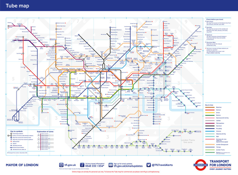
Image courtesy of Transport for London
Madrid Metro
Operating in Spain’s capital since the early 1900s, Madrid Metro has grown rapidly to become the 12th longest rapid transit system in the world with a total length of 293km. It’s a surprising feat given that Madrid is approximately the 50th most populous metropolitan area in the world.
Since its inception, Madrid Metro’s largest expansion took place when control of the network was transferred to public enterprise Metro de Madrid at the beginning of the 1990s. Between 2003 and 2007, Spain piped money into a multi-billion dollar development project to add 90km of new lines and construct 80 new stations on the network. Adding to this is the Metro Ligero light rail system that started operating in 2007, consisting of three lines covering 37 stations and totalling 27km in length.
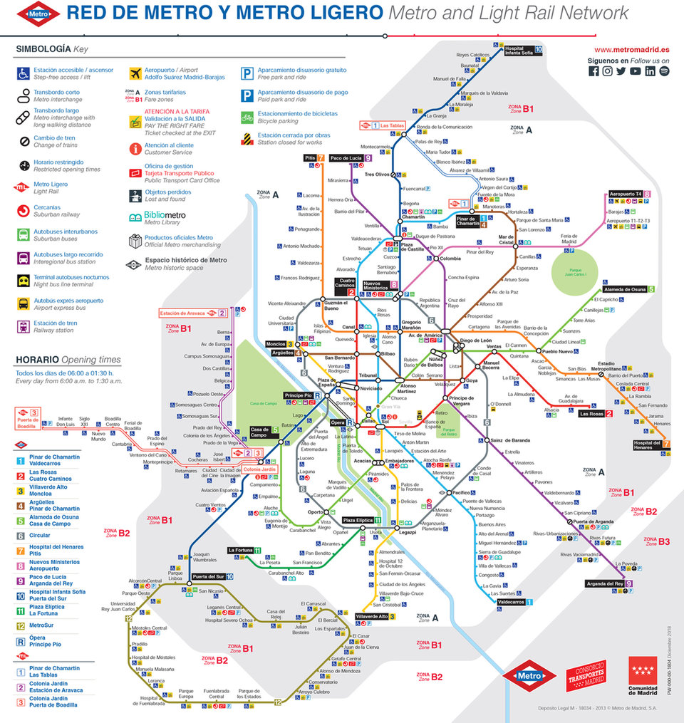
Image courtesy of Metro de Madrid
Paris Metro
Unlike the London Underground, which was largely built to ship people to and from the suburbs, Paris’ network was more about enhancing mobility in the city centre. This means a large amount of stations (245) within a very small space – leading to a much denser map.
A number of attempts have been made to redesign the Paris Metro map. In early 2016, Russian art director Constantine Konovalov revealed a new circular version of the map, in which Line 2 and Line 6 were recast into concentric circles framing the rest of the capital.
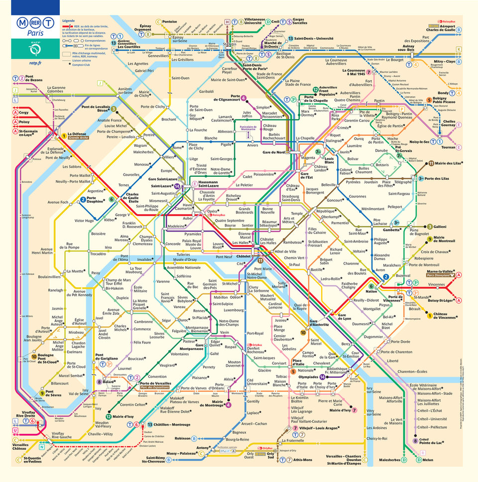
Image courtesy of RATP
Moscow Metro
Moscow Metro opened in 1935 with 13 stations spread out across the 11km-long Sokolnicheskaya line – the first underground railway system in the Soviet Union. Today, it is the busiest mass transit system in Europe, with 224 stations and a whopping 381km of track serving a daily ridership of almost seven million people.
Moscow’s transport circle has experienced major changes since the dawn of the millennium, with the 2004-opened Moscow monorail, Moscow Central Circle (MCC) lines and more than 70 new metro stations now visible on the map.
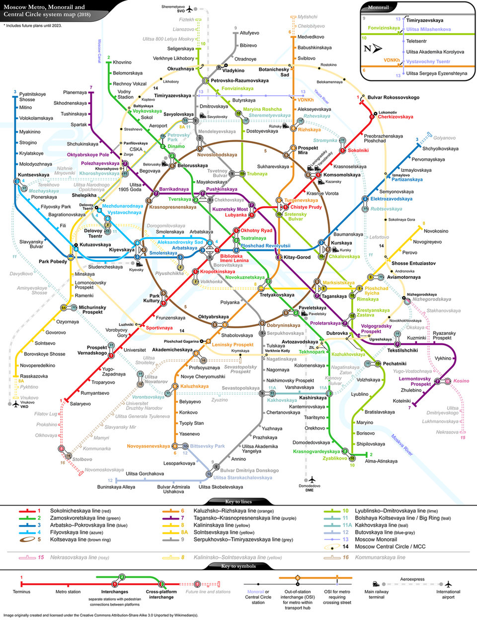
Photo: Moscow Metro. No credit